Spotify.com vision
This was a two day hack project done to allow the Design team to flex their creative muscle and work on problems they don’t always get to. Some people worked on quickly implementable ideas, but I wanted to take a product I was working on, and work without boundaries, as though I could start from scratch.
Team:
Sahana Kumar - Lead Designer
Timeline:
2 days
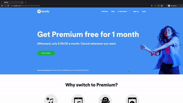
Current state
We had recently introduced The Storefront to the Premium page, which is a system for comparing plans on the same page. It was developed in Q3 of 2019 when a 3 month trial was introduced to all plans, and was meant to increase awareness for all plans. Since it’s been implemented, however, we’ve realized a lot of its limitations, primarily around allowing users to really understand the differences between plans, and it diminished our brand voice and made us seem bland and straightforward.
Goal and Principles
I wanted to tackle the Premium Page and set the goal of creating a more innovative, personalized Premium Page that allows users to select the plan best fit for them, whether prepaid or recurring.
I wanted to use the north star of my team’s design principles which are:
Emotion over Transaction, and
the UX lenses of Personalization, Customization, and Curation
Process
I quickly gathered as much existing research as I could find and created a thoughtful execution tree to try and quickly analyze the insights I encountered and identify the opportunity areas.
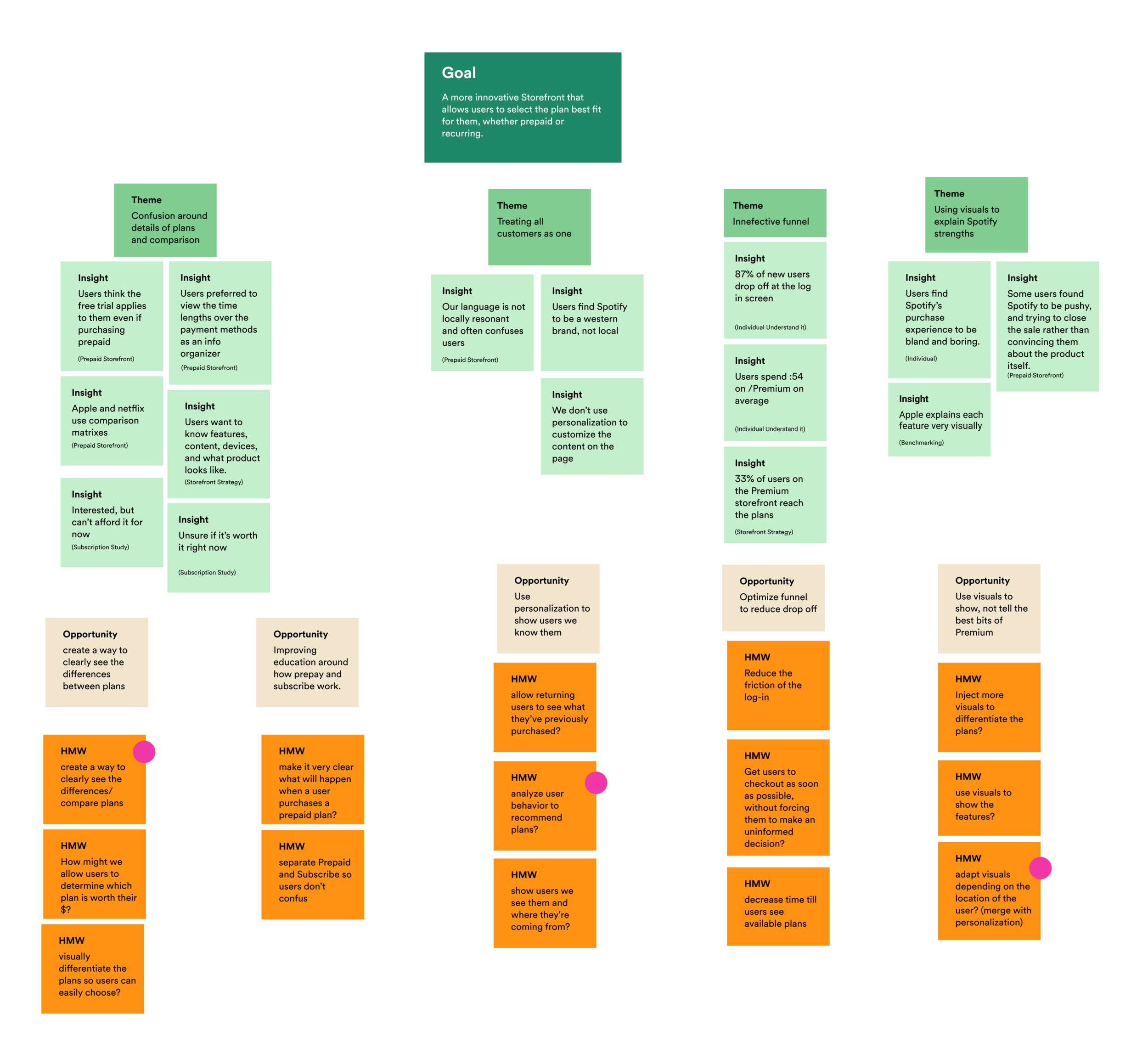
Opportunity Areas
I came up with five opportunity areas, with several ‘How Might We’ statements for each one. all of which I felt would have big impact on the storefront. Given I had one day left to explore the solutions, I selected two How Might We opportunities to move forward with.
How might we differentiate the plans so users can pick the plan that’s best for their needs?
How might we analyze user behavior to recommend plans?